The “why”
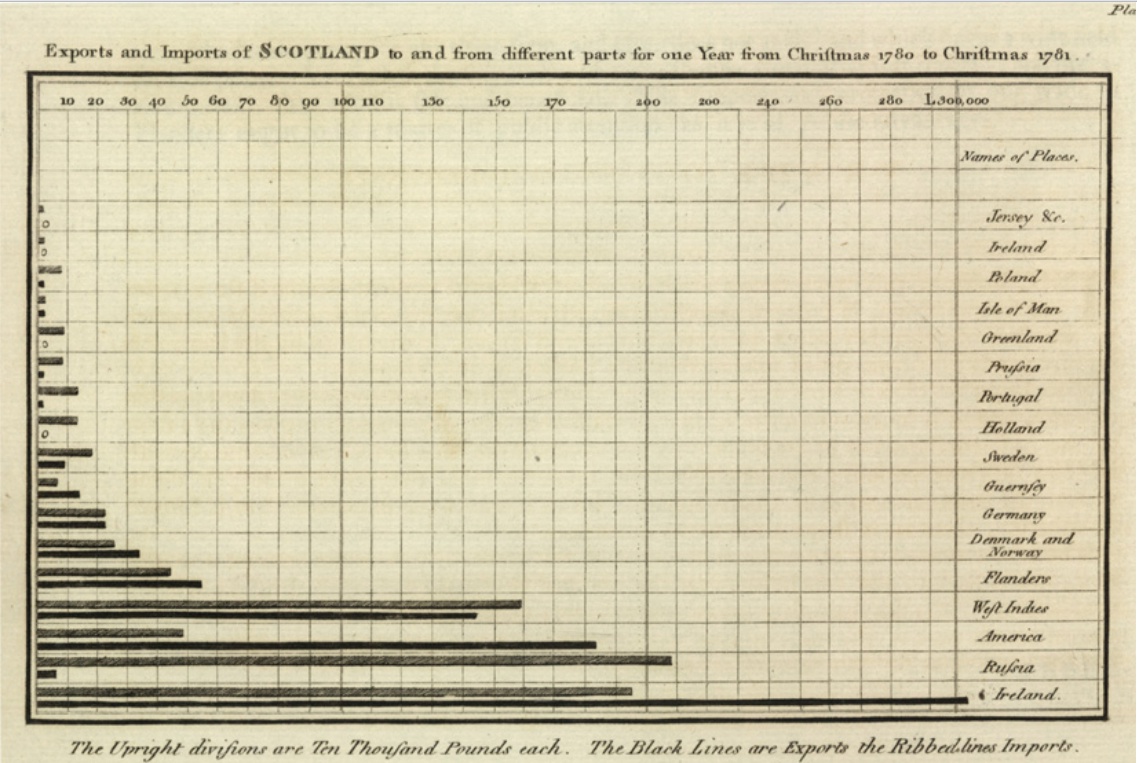
When I first see the graph above, I felt nothing; just an old graph from 1786… I didn’t know it was one of the first bar graphs in history. Then I realized a hidden fact: it was actually representing a universal code.
After conducting some research, I will share my opinion here along with examples of how the history of data visualization can shape our modern approach. 🥸 Because I think we still have some lessons to take from the history of the data visualization.
Beginning with Examples

Take a moment to look at the above and try to understand what it’s all about. Then ask yourself, how long it took to understand the graph? How sure are you about the message you get from the graph, and do you understand it correctly?
Then, take a look at this one:
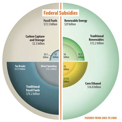
It looks cool, and it probably took a significant amount of time to create compared to a basic Excel chart. Now, try the same practice and attempt to understand the message behind it, along with the details the graph is conveying. How long it took? Are you 100% sure that you understood everything about this graph?
I will not delve into history here. Also, this is not an article about famous misleading graphs. My point is more related to the present day. I see a lot of “too complicated”, “overwhelming”, “cool looking but not going to the point” graphs since years. Even in highly professional reports, I sometimes encounter graph disasters. My question is, “what do we really miss?”
Another Comparison

Take a look at this graph, similar to the first bar graph in the beginning of the article. Do you really take a hard time to understand what’s going on? For me, it’s quite clear. Between 1688 and 1800, we can see the significant increase in England’s debts, along with the key events that contributed to this rise. The only missing piece of information might be whether this data is adjusted for inflation.
Now, again, let’s look another example from Wall Street Journal about remote working hours:
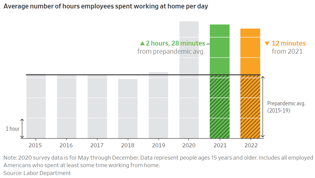
Again, another cool graph. Also, apparently, the graph is not intended to be misleading or done complicated on purpose. Yet, how long does it take to decipher this?
Now, instead of trying to break it down, let’s have a look another version of this same graph done by Kaiser Fung from Junk Charts.
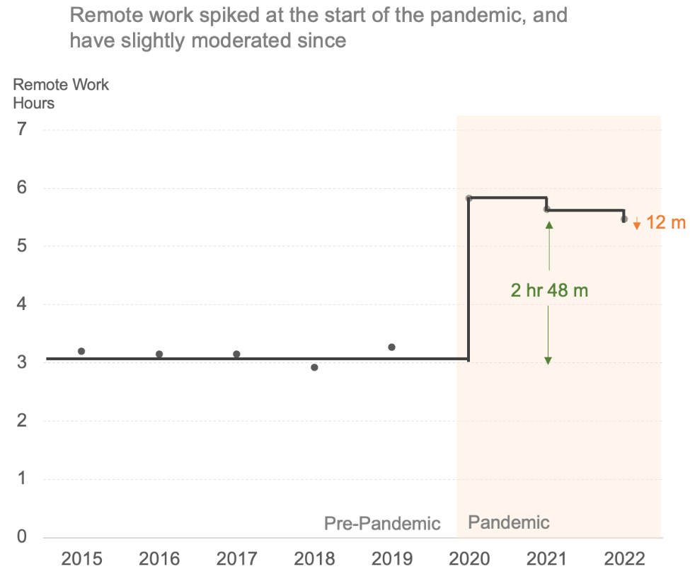
Much simpler, much refined and quickly understandable right?
What mistake did you notice here? What did the graph creators overlook in these two graphs? Also, what is the relation of all these with the historical graphs?
Returning to Roots
When the first time those historical graphs created, they were created to save time for people and make it easier to absorb the big picture. What was the alternative before them? Just data tables!
Long tables evolved to summary tables. Summary tables turned to charts and graphs. And the concept behind graphs began with one idea: sometimes, a picture is worth a hundred words!
Here is a master piece from one of my favorites, Pietr Bruegel :

In fact, just the explanations on the composition in Google’s Arts and Culture article are 465 words for this piece! Every part of the painting, each little detail is telling something in a beautiful way without using a single word.
When you replace text with visuals, even without considering the artistic aspect, it needs to be worth the effort!
Take a look at Nightingale’s famous chart:

This colorful representation of causes of mortality, illustrated by overlapping wedges. The enduring success of the chart is partly due to its unusual yet intriguing form; others at the time presented similar data using conventional line graphs that were less effective. As the middle story element of her visual argument, it elevated two comparisons. The first shows that deaths from preventable diseases (blue) greatly outnumbered hospital deaths from wounds (red). The second comparison, which is repeated from the first diagram, contrasts the first year (on the right) and second year (on the left) of the war. This comparison reveals a significant decline in mortality between the two years, connected by a dashed line, and prompts readers to wonder what factors led to such a pronounced difference.
I think, this is how the efforts of innovation pay back! Nightingale tried to capture the attention while giving the message in a beautiful way with a curiosity element involved!
False Innovation
A bad example of innovation looks like this:
Maybe the writer here tries to show “how does she feels” instead of the facts and reality itself.

Yet, this is a good illustration of how things can go wrong during the new styles on graphs.
This is a classical example of “shape proportion” mislead in data visualization. It’s just like the famous mislead of “The Times vs. Daily Telegraph”:
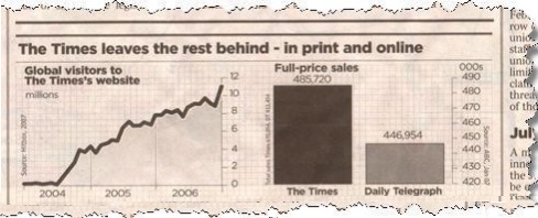
On the right side, bar graphs say : ” The times is selling more than twice than Daily Telegraph” when you compare the bars. Yet, take a look at the axis on the right and the data labels. There is only 40K difference instead of 200K!
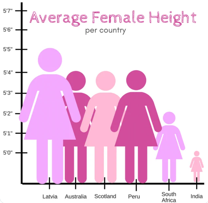
Again for our female heights graph, actually the difference is just 5 inch but it looks like Latvian women seems 3-4 times more than Indian women! 🤯
Conclusion
Nightingale’s data visualization is more complex and intricate compared to Playfair graphs. However, it’s worth the effort! Each layer of complexity should yield benefits.
Key takeaways for me:
Cool-looking visuals with nice colors are fine as long as they don’t become excessive and, more importantly, don’t completely obscure the message.
The graphs from the 18th century are still easily understandable because they adhere to simplicity and address the primary practical question!
Using visuals instead of text or numbers should function in a manner that doesn’t require explicit explanation through lengthy supporting text.
Utilizing bar graphs, pie charts, or line charts for decades wasn’t merely a coincidence. They are embedded now to our ways of information sharing. Therefore, instead of attempting to overly complicate, leverage the effectiveness of this traditional approach whenever possible.
When you go innovative like nightingale, don’t forget to stick to the main question and main message which should be taking the eye easily in the first glance!
I hope you liked the article! 🤗
for the better visuals… 📊📈