Power BI Case Study - Databel Customer Churn
Background
After my first case study which I pretty much followed the Datacamp’s images and given design in the previous case study, I will share another case study, again from Datacamp in this article. However, this time I used my own design and dashboarding style in a dark theme over blueish & purplish kind of color set. I hope you like it! 🎨🖌️🤗
The Dashboard
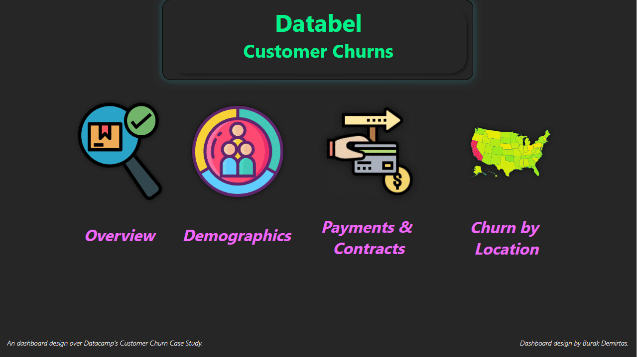
This case study is about an imagonary company called Databel and by creating a dashboard, you need to answer certain questions like “which is the worst state in churn rate while it’s the highest in average customer service calls?”. 👾
The view of the dashboard is available in the video(gif) below. Yet, if you have any questions in different parts, you can post in the comments or e-mail me using the little envelop on right hand top corner. 😉
Conclusion
I just want to highlight some points for this design:
- For the buttons with icons, do the on hover and click changes seem cool? If they are, that’s great because all you need is PowerPoint for them! 😋
- Check out the slicer in the payment methods page. Did you use that visual before? 🥸
- I think the way I used the donut charts instead of pie charts seems much better! What do you think?🍩
- Check out the switch between maps and map legends! 😉
It was also the first time I used mobile layout function of the power BI and I think it’s also really cool because you can customize all the layout differently for mobile! You should definitely try if you didn’t do yet.
See you on the comments! 🥳